Friday, January 31, 2014

Douglah Designs


I'm not sure I'd ever manage to leave this room if it were mine! Douglah Designs out of Lafayette, California created one heck of dream bathroom, didn't they?! Benjamin Moore's Quiet Moments really sets the mood for a serene, spa-like space, and all the gorgeous marble tile doesn't hurt either! Big bathtub, giant shower, plenty of storage, great lighting, even a cozy little window seat...yup, definitely my dream bathroom! To see more great kitchen and baths from Douglah Designs, head on over here!

Have a great weekend everyone!!


Love turquoise? Visit my shopping blog Everything Turquoise...updated several times throughout the day! Check out Decor by Color for even more color-themed shopping!

Thursday, January 30, 2014

8 Simple ways to make your space interesting

Details in decor can make or break a design especially when you have a more minimal look (not a lot of stuff around).  You need something interesting  to draw the eye and provide a  momentary resting place.  It might be a texture, a beautifully shaped stool, or an embellishment.  A space without details is immensely boring and who wants a boring home?   Here are simple ways to add some pizazz to your space. Each  space will have a different starting point.


1. Use art  to create a vignette


art vignette yellow interesting space
Eye catching art anchors design

Choose eye catching art and use it to create a vignette.  In this space the yellow chair creates a visual flow from the artwork and it is anchored by the stripes in the rug. Books provide a casual look but other items could be added to the bench to continue the tone set by the art.

   2. Add pattern and texture

greek key pattern texture interesting space
Greek key detailing adds interest

The addition of pattern to any space instantly makes it more interesting .  Also consider using texture for a quiet way to add additional interest.

 3. Bring the outside in

wood stool bathroom interesting space
 Add outside materials inside


 Who wouldn't notice the natural wood element in this stool in a hard edged bathroom.  The repetition of natural shapes from outside to inside woks so well to move the eye to the welcoming outside view.

4. Layer furniture and accessories

bookcase wallpaper focal point interesting space
Patttern and colour with accessories create a complex focal point

 Some focal points are large and a room is created around them.  Other times a secondary focal point can be introduced in a quiet corner of a space. This solution works when there are several seating areas in one space. Layering furniture and accessories is one way to create interest.


5. Choose spectacular lighting

Tom Dixon lighting interesting space
 Spectacular Tom Dixon lighting


 Who could ignore the variety of shapes in these black pendants  that anchor the dining space in an open concept home? There are all kinds of lighting choices to adorn your space.  Find the one that is right for you.

6.  Use geometry

black white stripes hexagons gold  interesting space
 Black and white is always eye catching

When you combine several geometric shapes in one vignette, it can create a powerful focus.  When you add high contrast it is difficult to ignore.  Pop some gold into the combination and you have to look - more than once!


 7. Use common items in unique ways

starfish mirror interesting space
 A simple starfish repeated many times

Take one starfish and it has an interesting shape.  Repeat that shape many times by overlapping and you have a sculpture that begs to be looked at and touched.


8. Use pops of  warm colours

Red is an eye catcher

If you want instant attention choose red, yellow or orange as an accent.  Warm colours beg to be noticed by advancing visually in your space.

Now that was easy.  If you have a space you aren't pleased with perhaps one of these suggestions might help to create more visual interest. Do you have favourite ways to create interest in your home?

Katie Rosenfeld Interior Design


Boston-based interior designer Katie Rosenfeld is someone I would love to come decorate my own home! Her savvy use of color and brilliant way with pattern and texture make her one of my favorite designers. Better yet though?? She is queen of mixing high and low! Take this fabulous Cape Cod home photographed by Michael J. Lee for example. We're talking Home Depot kitchen and bathrooms, store-bought furniture and accessories mixed with beautiful designer fabrics...all for a look that is totally gorgeous and custom-looking! Katie talks all about the home and her "design on a dime" thoughts (and shares before pics!) on her blog, definitely worth read over here!


Love turquoise? Visit my shopping blog Everything Turquoise...updated several times throughout the day! Check out Decor by Color for even more color-themed shopping!

Wednesday, January 29, 2014

Coastal Cottage Dreams


As we forge through the coldest winter ever, I can't help but long for an afternoon on this porch! Kelly from the blog Coastal Cottage Dreams lives in a small coastal town in South Carolina...and is probably covered in snow right about now too! (What is up with this weather?!) Is her porch not the cutest, most perfect thing you've ever seen?! A turquoise lover's dream come true! You can read all about it and see more pics right over here! Now please pass the sweet tea!


Love turquoise? Visit my shopping blog Everything Turquoise...updated several times throughout the day! Check out Decor by Color for even more color-themed shopping!

Tuesday, January 28, 2014

House of Ruby Interior Design


Drop. Dead. Gorgeous. I instantly fell in love with this room designed by Melodie Rubin of House of Ruby Interior Design when Cristin of Simplified Bee toured the 2013 Peninsula Volunteers Decorator Show House in Woodside, CA. A Traveler’s Retreat Bedroom, photographed here by Kathryn MacDonald was designed as a serene sanctuary for the home’s invited guests. Can you imagine a more tranquil, beautiful place to rest?! I absolutely love every single detail! And I'm also happy to report that some of the items from the room are for sale (see below)! You can see Cristin's post about the space here, and learn more about the room and see before shots here!
Sources
Paint on Back of Shelves – Benjamin Moore HC 142, Stratton Blue
Bedside Lamps – Beeline Home by Bunny Williams through Lee Jofa
Bedside Tables – Currey & Company
Carpet – Stark
Chandelier – Canopy Designs
Cocktail Table –Made Goods
Desk – Grandin Road
Desk Chair –Murray’s Iron Works
Desk Lamp – Robert Kuo through McGuire Furniture Company
Sofa – Lee Jofa
Wallcovering – Nina Campbell through Osborne & Little
Window Treatment Fabric –Manuel Canovas through Cowtan & Tout

For Sale
California King Kolkka Custom Iron Bed Frame
Custom Bedding
Made Goods Sebastien Cocktail Table
Canopy Designs Birdcage Chandelier
Visual Comfort Dean Picture Lights
(Contact House of Ruby for more info)

Love turquoise? Visit my shopping blog Everything Turquoise...updated several times throughout the day! Check out Decor by Color for even more color-themed shopping!

Monday, January 27, 2014

Francesca Owings Interior Design


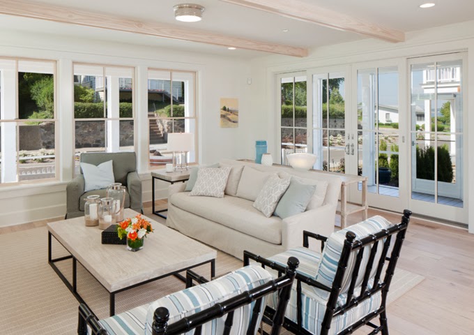
Bright and airy, serene and relaxing...what more could you want in a beach cottage?? Located on Lake Macatawa in Holland, Michigan, this beautiful home designed by Francesca Owings Interior Design is coastal perfection! Love the neutral palette with pops of sea-inspired color, all the comfy furniture, beautiful flooring, and cute bunk room–a must-have in any beach home! Bet the view off that widow's walk is incredible too! Finish your tour of the home over here!


Love turquoise? Visit my shopping blog Everything Turquoise...updated several times throughout the day! Check out Decor by Color for even more color-themed shopping!

Sunday, January 26, 2014

Leaning art: 4 Guidelines to make it work

Art warms a home, makes it interesting, provides topics for conversation and contemplation , adds colour,  the list goes on indefinitely.  There are various ways to display art; some are more successful than others.  One option is leaning  art against a wall rather than hanging it, but this display option isn't always successful for a variety of reasons.  If you want to try leaning art, consider the following factors.

1. Scale - Choose artwork large enough to read from standing or sitting  position


leaning art

 
 The size of a piece of art in comparison to the space and objects around it usually determines successful placement. This painting fits the bill perfectly.   

leaning black and white large scale art
 Large scale images work best

source
When you want to lean work on the floor it needs to be large enough to observe from standing position and bold in imagery so it can be read at a distance. Even the dog get this!
 The photo on the right works better than the  the art to the left of it because the image is tiny. 


large leaning abstract art dining room

Perfect scale and beautiful work that can still be seen and read while sitting or from other areas of the room. 

simple black and white composition leaning art
Bold form and simple composition

source
The boldness and simplicity of this painting  make viewing it easier when leaned on the floor.  The objects in front of it enhance the placement and help to anchor it safely. They do not interfere with the reading of the image. Which leads to the next guideline...

2. Layering: Don't cover major parts of an artwork

abstract leaning art with chair
Successful layering

source
Layering other objects in front of an artwork is a tricky business.  This vignette is successful because the image is large, dark and has quite a bit of space where there are no details.  The chair and table lie in areas without too much detail.  You don't feel as if you are missing  important elements of the work. 

large leaning artwork behind table
Do you want to remove anything here?

source
There are so many things about this vignette I love, but I want to see all of the artwork and part is hidden by the table and books.  Even removing the books would help things considerably.   Love the candlesticks and the table, both really work with the artwork.


leaning art on mantle
Successful layering where each image is clearly seen.

source
 Layering art on shelves, consoles, and mantles can be very interesting. It is a way to display smaller pieces  to good advantage.  While this is a very simple vignette with the branch acting as a consolidating element, it is possible to have more complex collections of objects.

3. Colour scheme:  Restrict colour combinations in  leaning gallery display

 
gallery wall limited colour scheme
Limited colour scheme provides cohesion

 There are lots of small pieces in this display but they read as one unit because of the colour cohesiveness.

4. Image: Choose the right image for the space

red airplane leaning art
Art with simple bold form


I think the work that layers best in a vignette has bold form and colour.  It can compete with the other objects for your viewing attention.


Now it's your turn.  What do you think of this arrangement?

 framed art leaning