
Out of all the colours in the Benjamin Moore palette, how and why was Vintage Wine singled out as "the" colour for 2011? Benjamin Moore's team of experts observe the world looking for inspiration and trends. Sonu Mathew, senior interior designer at Benjamin Moore and blogger, notes that the team is always looking two years ahead. That means that the colour of year for 2011 was chosen in 2009! The key concept for 2011 is balance - buying into our efforts to find calming influences in a hectic, disorderly world. As Sonu puts it "Remember that 2011 is all about balance- work/play, nostalgia/future state, new purpose/old materials". There's no doubt Vintage Wine is a calming colour that is both comfortable and luxurious at the same time.
What would Vintage Wine look like in our homes?
Trends in colour are just that - trends or patterns to be considered. Does it mean we should repaint walls a deep brownish purple? Perhaps not. If you like a colour there's a continuum of possibilities for its use from over the top to the merest hint of it.
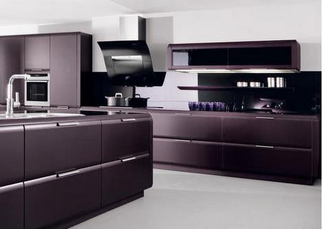
This is my over the top application of a vintage wine colour. I'm practical to the core and my personal design instinct for my home is casual contemporary with lots of light colours, but I love to contemplate extremes even when I know I could never live with them . This kitchen fills all my fantasy needs. I love its depth of colour and sleek lines, but I couldn't live with it for twenty years. That's my criteria when choosing hard surfaces or built ins in my home.
Design Hint: Consider using a strong colour as a backdrop behind a light coloured bed or sofa. It allows you to keep your remaining walls light and include a strong vertical line in rooms where horizontal lines dominate. It is also a great way to integrate dark and light furniture into a cohesive design.


Design hint: Use dark colour on walls to provide contrast with light furniture pieces. This application allows you to highlight your furniture while still controlling your light colour balance. My preferences are showing! Dark rooms and dark furniture depress me.

This very sleek, modern room uses a purple green scheme as a backdrop for creamy white. I like the way that the vintage wine colour is used modestly as an accent.
Design Hint: Are you tired of your wood grain entertainment unit? A current trend in decorating is re- purposing furniture. You many not own built ins that look like this, but you can achieve the look with a similar paint combination.
Design Hint: Are you tired of your wood grain entertainment unit? A current trend in decorating is re- purposing furniture. You many not own built ins that look like this, but you can achieve the look with a similar paint combination.

Just because I love the table and the sparseness of the room.... The sofa, plush and plum, is the luxurious item in the room.
Design Hint: Every room should have one luxurious item in it. Size doesn't count.
Design Hint: Every room should have one luxurious item in it. Size doesn't count.

Sarah Richardson via Decor Pad
Design Hint: If you don't want to commit to design trends in a big way, accessorize with them. Pillows make great trend statements. Consider recovering them when you want to nod toward the next colour trend. As always the magic colour, white allows you to do so much.

What are your thoughts on using trend colours?
0 comments:
Post a Comment